A Photographer's Style
- C.J.

- Feb 5, 2020
- 3 min read
I've written about my shooting style and I've written about how I edit my photos. This post is about a combination of both those things; that is, my style of photography and why I edit photos the way I do. Anyone planning a wedding and looking for a photographer will quickly weed out a few professionals based on quality. Then a shopper will often make a final decision based a preferred style their favorite photographer has.
In my post about how I edit my photos I stated that I edit my images 'faithfully' to represent skin tones and all colors in the background as accurately as possible. Occasionally I do take creative license to subdue certain colors that are distracting from the main subject or I may adjust contrast in a way to make a bigger impact. But in this post I will show you the long term benefits of receiving 'faithfully' edited wedding images.
I'm going to pick one image from a past wedding and do some comparisons with the edit. Let's use this one from David and Kelci. These two base images were both edited in Adobe Lightroom. It's a nice candid moment and shot with all natural light so it's a fairly 'normal' image in terms of tonal range and what you can expect with the majority of your final images. It's backlit so there are no highlights on the faces and it's generally what we photographers look for in our portraits.
Let's look at the image on the left. This is a 'faithful' edit, meaning the colors in the image are as accurate as I remember them when I took it -- and I think it looks good.
Now to the image on the right: This is the same image with a desaturated and higher contrast look. This edit has a bit of a matted look. Besides being more color neutral, the highlights and shadows are crushed a bit (meaning the highlights are brighter and the shadows are darker -- it has more contrast). This is NOT a 'faithful' edit because the color tones are no longer accurate. But it doesn't matter because this also looks good, right?
This is a style a lot of photographers have and I love their images. This image carries an impact the other one doesn't and I like this one a lot. These color differences are what shoppers see first when looking for a photographer.
My fiancé, Katie, loves this look and if she decorated our future house with our pictures they would probably be desaturated like this one.
So why do I stick to the 'faithful' edits? I'm going to show you.
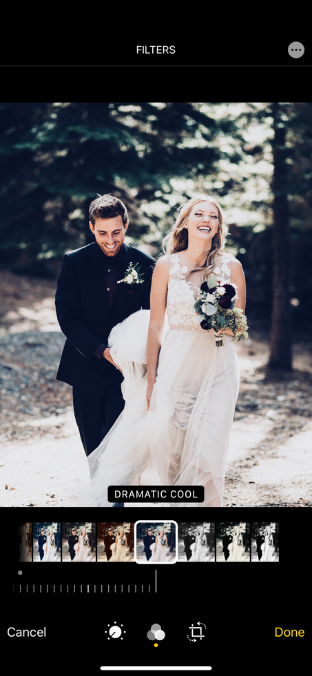
Below are two slideshows of the above photos edited with the iPhone11. The first one is the faithful edit, which, as you will see, has a lot more flexibility when it comes to allowing you to get the look you want. All the filters applied are turned up to 100% by default.
If you slowly cycle through the filters of the faithful edit above and the desaturated/contrasty edit below one at a time you can see how more tones on the bottom row get completely lost. You notice it first with the skin which is the most important aspect of any portrait. Also, If I chose one of the "DRAMATIC" tones for the faithful image I come pretty close to the original image on the bottom.
Now let's try with instagram.
There are 23 filters on instagram and the horse is now definitely dead, so to speak -- That was a lot. My conclusion is this: the faithful image gives you much more flexibility to do what you want with while the second image limits you tremendously. You can't reverse the effects of a desaturated image with crushed tones -- there's no getting that information back. But with the faithful image you can take it in any direction you want and not end up with a muddy, overworked image. In the end, it's all a matter of preference. My preference is clear: I want to give my clients the most faithful image possible so their wedding photos will endure the test of time.
What's your conclusion? Leave your comments below :).


Comments